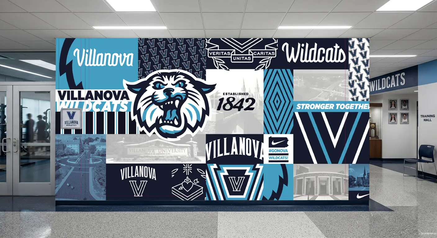

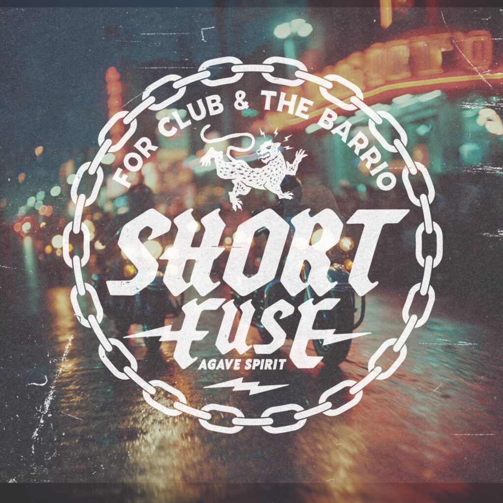
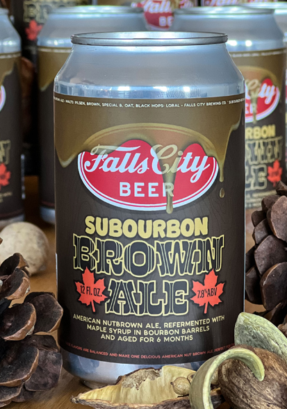
Process Shot
A behind-the-scenes look at the creative process and early iterations.
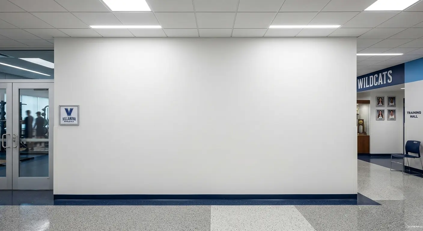
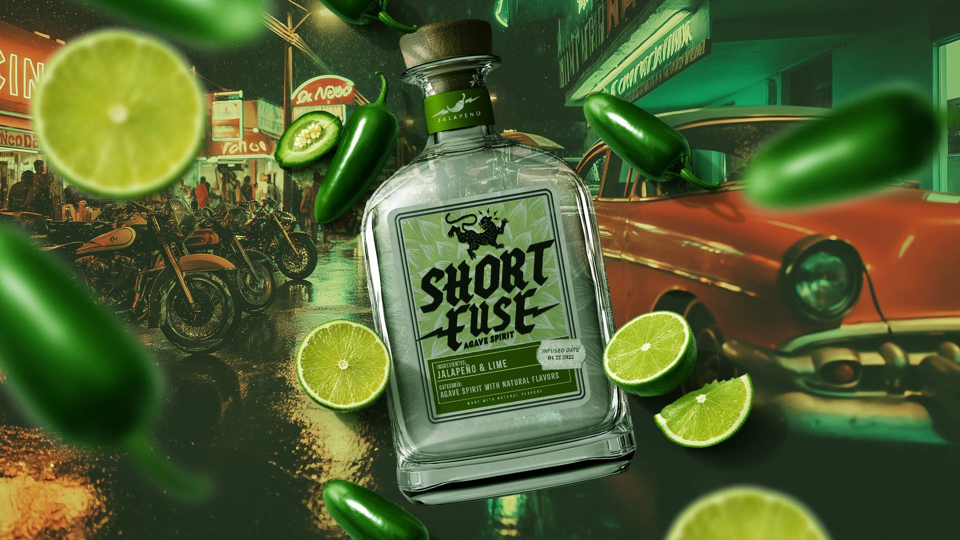
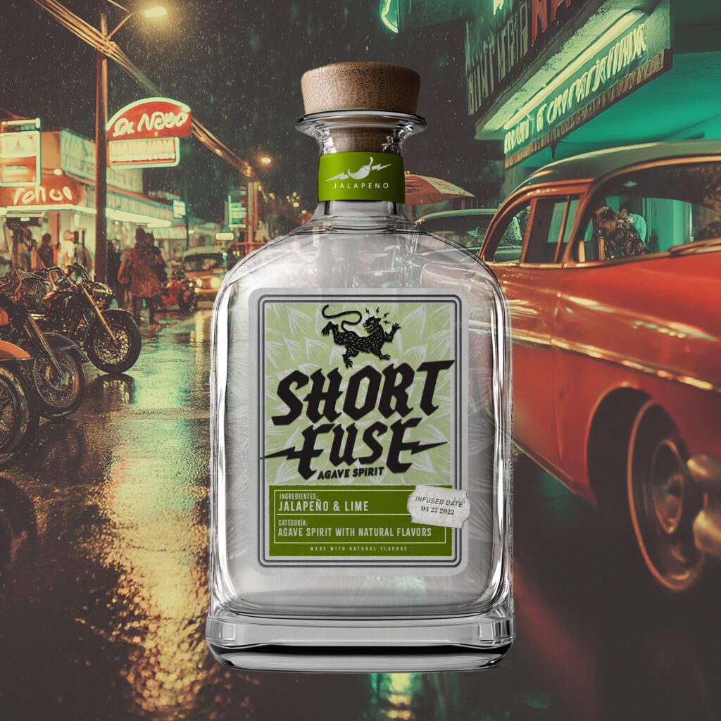
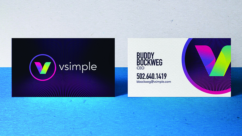
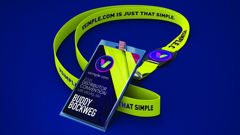
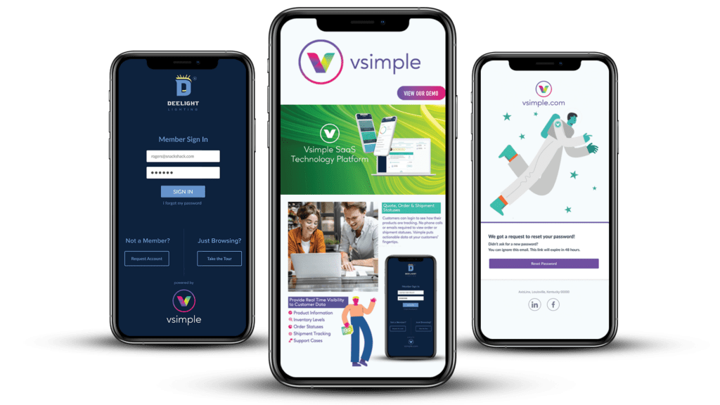
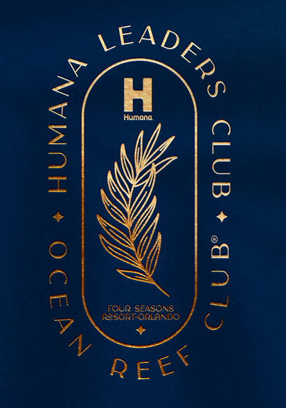
Final Result
The polished deliverable — ready for the world to see.
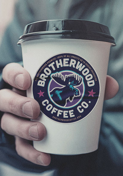
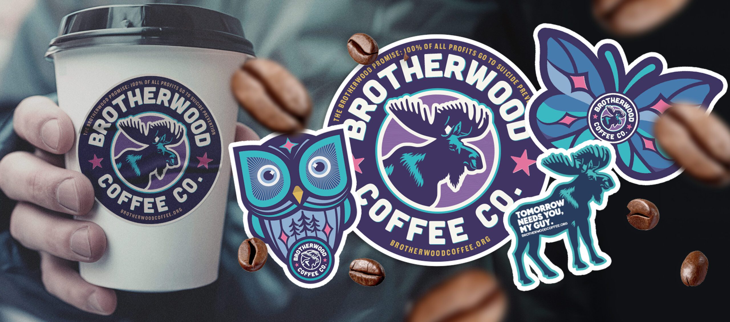
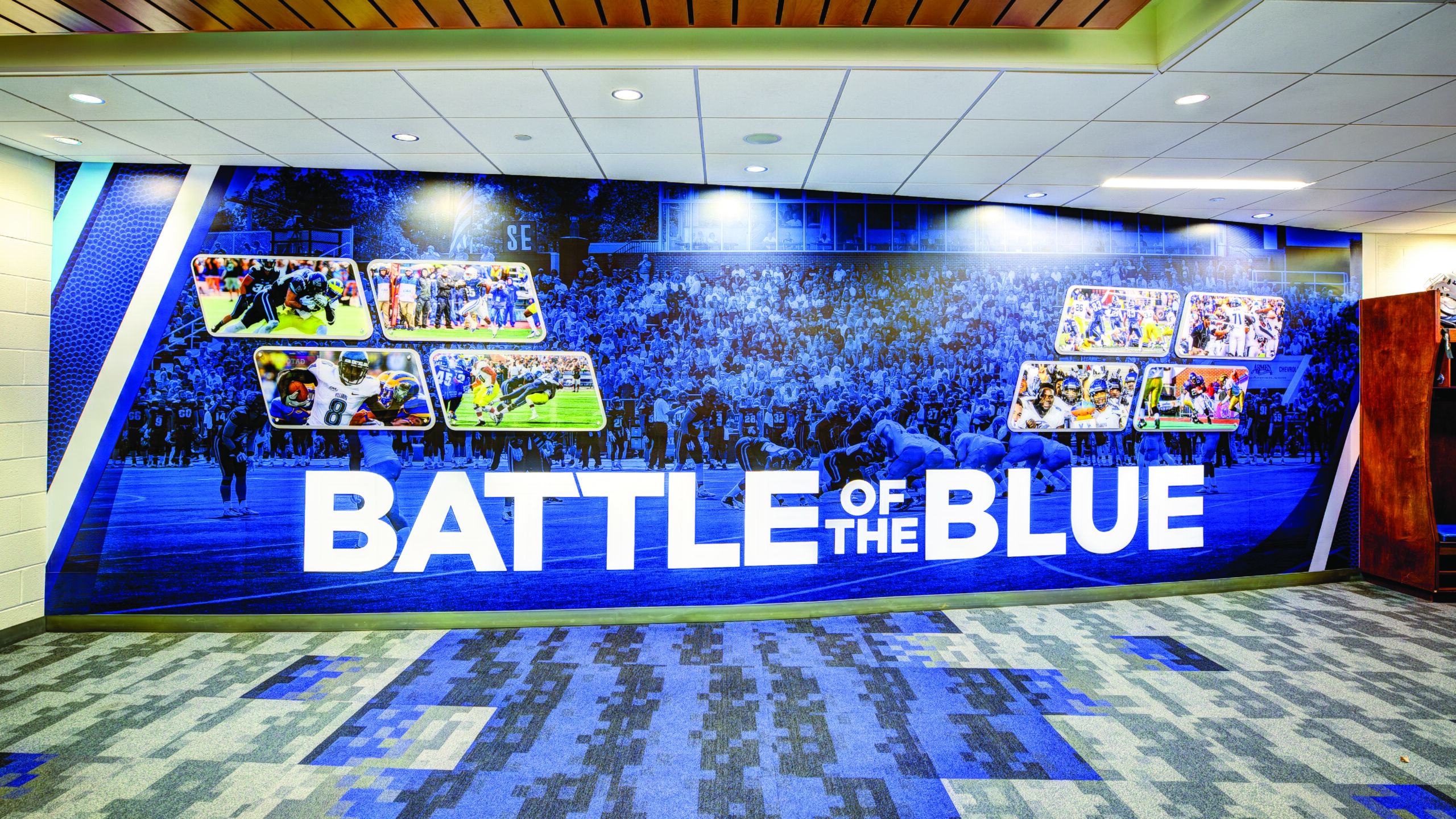
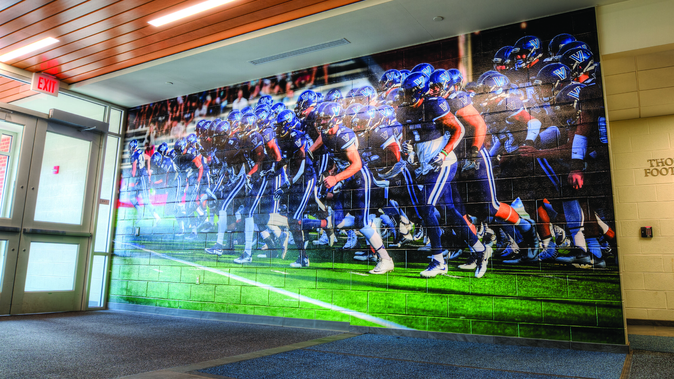
Brand Identity Redesign
We reimagined the entire brand identity from the ground up — crafting a fresh logo, cohesive color palette, and a visual language that speaks directly to a younger, design-savvy audience.


“Fantastic design, listened to my needs, and delivered on time. Highly recommend!”

Jessica Taylor
Creative Director | XYZ Corp
“The team was awesome! They turned my vision into reality and kept me updated throughout.
Mark Johnson
Marketing Manager | ABC Inc
“Incredible experience! They captured what I wanted perfectly and delivered beyond my expectations.”
Samantha Lee
Owner | Home Goods Co.
“Loved working with them! Quick responses and creative solutions that fit my ideas.”
David Kim
Business Analyst | Tech Solutions