ISCO 20/20 Vision
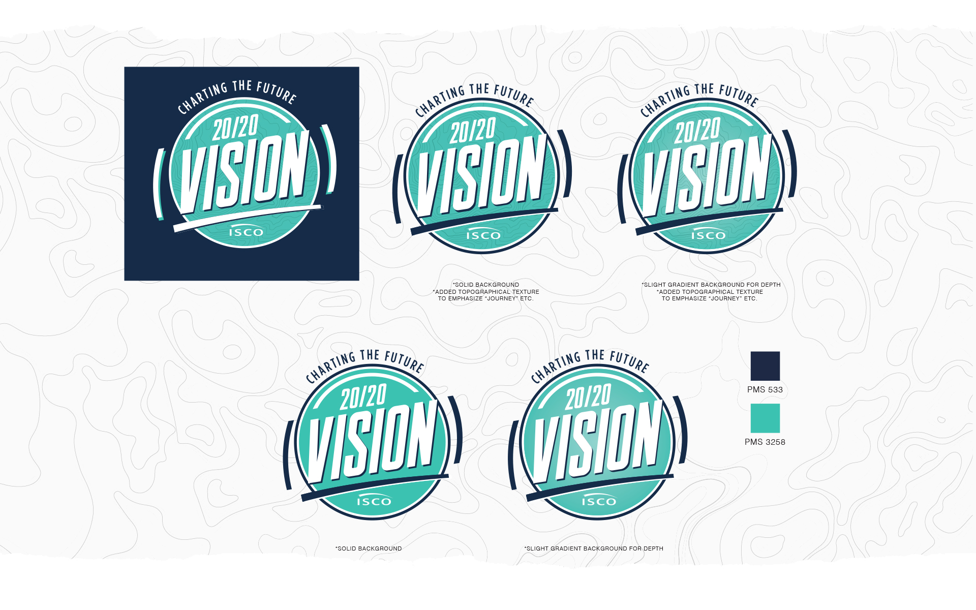
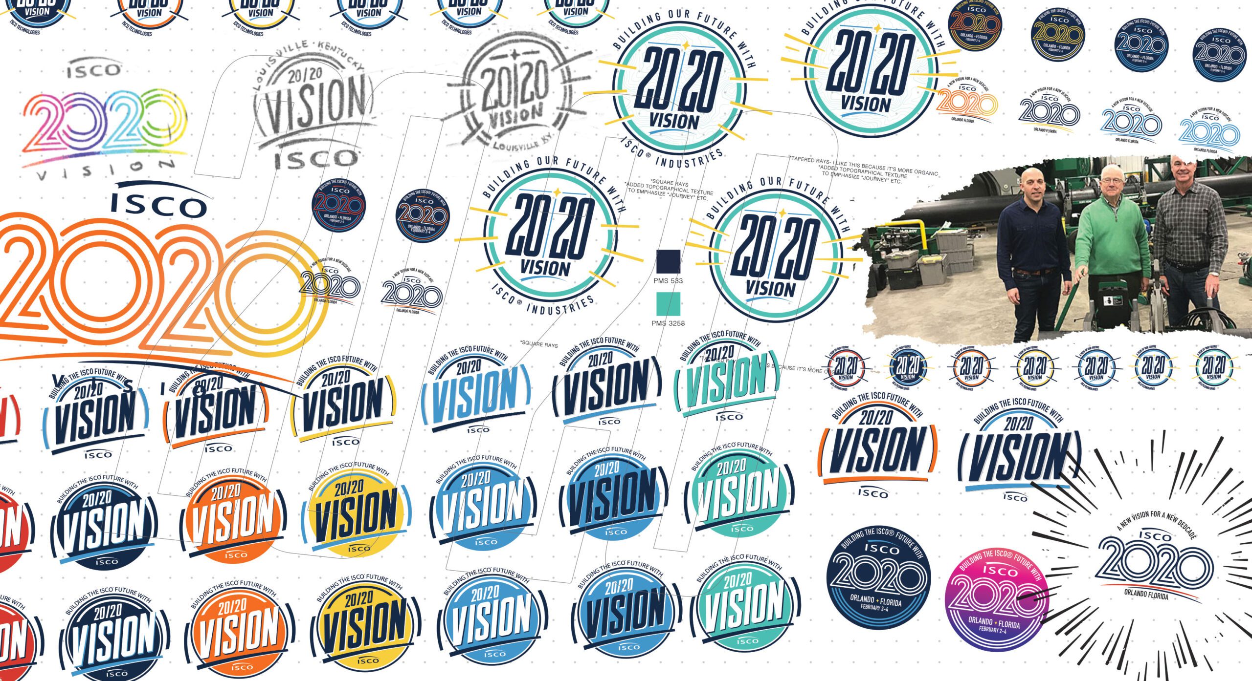
Event logos are my sweet spot! Somehow I have developed the ability to capture the perfect amount of “corporatism” in my designs. The client wanted something “circular” and that would portray well over a series of swag.
“Charting the Future” is the line, 2020 is the vision! ISCO and Vidionix approached me regarding the new logo for the corporate event hosted by ISCO. I knew I had to bring green in the color palette because the client wanted to really push a “Green Movement”- The client had produced the idea that the year 2020 looks like the vision marker 20/20 and wanted to use the focus word to be “VISION”! They want to really the idea coming out of this event to be a look into the future of the company.


Date:
Jul 2020
Client:
ISCO
Location:
New Albany, IN.
Contact:
Dom Fitzgerald

